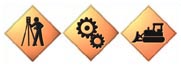
Sanda created icons for Tripod Data Systems
to represent the different industries the company serves,
such as surveying, manufacturing and construction.
You want to print the Web
page you're looking at. So
you glance up at the row of thumbnail-sized pictures across
the top of the screen. It's not hard to figure out
that clicking on the one that looks like a printer will get
the job done.
That's an icon at work.
Icons are not a product of
the computer age. In fact, long before our ancestors discovered
how cool alphabetic writing
is, they relied on icons to record transactions and events.
Historians call the icons they used to represent fish, oxen
and other objects "pictograms."
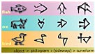
The first icons? Early Mesopotamian pictograms
used to represent a fish, an ox and a bird.
Modern Chinese ideograms, which represent abstract concepts
as well, are not far removed from early iconic writing.

Evolution of the modern Chinese ideogram
for "tall."
You
might say that icons are in our blood.
But why use an icon
for a command instead of a word or phrase that says exactly
what the command does? Compactness. Words
are great for short lists of commands. But what if you
need to give a user quick access to 49 commands? That's
when icons become handy. (I picked the number 49 because
that's how many commands Microsoft Word gives me
access to on just three palettes.)
The last thing you want to do
is torture your customer. Icons create a user-friendly interface
that lets your customer
perform commands with a single mouse click.
Combining the
familiar and unfamiliar
What makes a good icon?
A good icon builds on what the user
already knows. It's
easy for a reader to associate an icon that looks like a
printed page with the concept "document." Combining
another familiar element—a plus sign—turns it
into "add document" or "new document."
What
about unfamiliar objects?
Your products might require that
you introduce icons that are at first unfamiliar to
the user. Introducing a limited number of these new icons
and combining them with familiar icons will make it easier
for your user to learn how to navigate through your software
with ease. After the user learns to recognize that a new
icon represents a scanning terminal, for example, he or she
will recognize almost instantly that the same icon combined
with an arrow-shaped "refresh" symbol means "update
terminal," and adding a red exclamation mark to that
means "update terminal now."
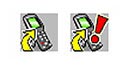
Sanda created these icons for PSC, a
manufacturer of bar code scanners. They combine a familiar
refresh symbol and exclamation point with an icon for the
unfamiliar scanning terminal.
Icon families
By marrying familiar and unfamiliar icons you end up creating
entire families of icons that represent related commands.
Not only does this simplify the user's job of navigating
through your software, it simplifies the job of creating
the icons, too.

Sanda created this family of icons
for PSC. The first represents a package. The second represents
the "add a package" command. The third represents
a group of packages. What icon would represent adding a group
of packages?
Subtle promotion
Icons are primarily used for commands, but they also provide
a subtle opportunity to burn your company's corporate
identity into a user's mind. Is your company's
corporate color teal? Make sure the same color finds its
way
into the color palette for your software icons. Your company
logo, corporate typography and other design elements are
also
fair game for the icon builder.
|
|
(roll
over buttons to see them in action)
|
Sanda incorporated
PSC's company colors, orange and blue, into
the icons used to navigate its Falcon Management
Utility
software.
|
The lesser of two abstractions
The sample icons we have shown so far represent—in
most cases—highly abstracted concepts like "adding" and "updating." Sometimes
you need an icon to represent an actual object. In cases
like this, it's best to tone down the abstraction and
make the icon a more literal interpretation of the thing
it's supposed to represent.
Sanda created realistic icons for system-building
software created by GE Interlogix, a manufacturer of electronic
security products. Because the icons represent actual product
models, Sanda chose to make them nearly photographic.
Sanda understands
the art of icon creation, from creating simple two-dimensional
artwork to creating icons for Microsoft
Windows XP, which incorporate perspective, smoother edges
and drop shadows. We also understand the science of icon
creation, and because we have worked with technology companies
for years, it’s easy for us to familiarize ourselves
with your company and product and in the end add value that
would be hard to gain elsewhere. |